Housing Price Predictions

This post is a work in progress. I am going to start with a bare-bones model workflow using the Tidymodels ecosystem for machine learning in R. We will then explore ways to improve our models predictive prowess.
We are going to use the Ames housing dataset, available in the AmesHousing package, to create a model for price prediction. The dataset contains 81 features on 3000 home sales around the University in Ames, Iowa between 2006-2010. We’re going to try and use these features to train a linear regression model. This version of the data is clean but we will need to do some basic data engineering before we can train our model and test it.
ames_df <- make_ames() %>%
  janitor::clean_names() # extracting the data from the AmesHousing package and converting all column names to lower snace_case

# Here are a few functions that I used to get an initial feel for the dataset
#ames_df %>% count(neighborhood)
#summary(ames_df)
#View(ames_df)
#dim(ames_df)
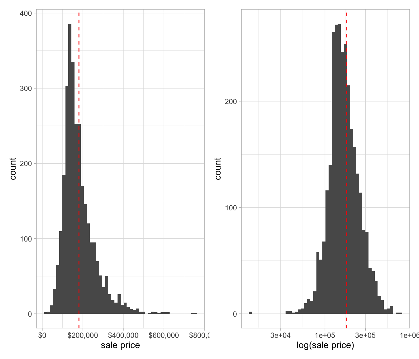
Since sale price is our feature of interest, let’s consider the home sale price distribution. Even before we visualize sale price, we can imagine that the distribution might be skewed in the direction of higher price, owing to a few uber-expensive mansions. If that’s the case, we will want to apply a log transformation to the sale price before modeling.

Figure 1: A.) Distribution of house count vs. sale price. B.) With log transformation with of sale price. The dotted red line is the median price.
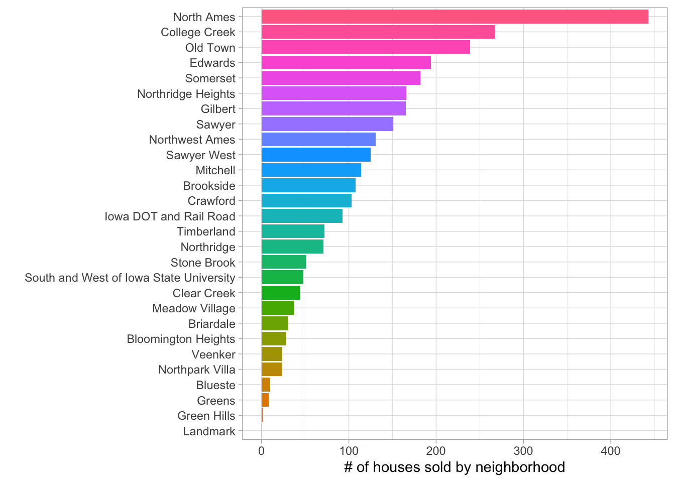
Let’s also visualize how the house sales are distributed across neighborhoods.
ames_df %>%
  count(neighborhood) %>%
  mutate(neighborhood = str_replace_all(neighborhood, "_", " "),
         neighborhood = fct_reorder(neighborhood, n)) %>%
  ggplot(aes(n, neighborhood, fill = neighborhood)) +
  geom_col() +
  labs(x = '# of houses sold by neighborhood',
       y = "") +
  theme(legend.position = 'none')
How has the sale price changed with time? The boxplots below show the sale price for each year in the dataset. The median price, specified by the black line in each box, is relatively stable over the five-year span.
p <- ames_df %>% select(neighborhood, year_sold, sale_price) %>%
  group_by(year_sold) %>%
  mutate(avg_sale_price = mean(sale_price),
         year_sold = as.factor(year_sold)) %>%
  arrange(year_sold) %>%
  ggplot(aes(year_sold, sale_price, fill = sale_price)) +
  geom_boxplot() +
  theme(legend.position = 'none') +
  scale_y_continuous(labels = comma)

plotly::ggplotly(p)
Geospatial analysis
The dataset includes longitude and latitude coordinates for each house. Using the leaflet package, we can plot the house locations by neighborhood. In addition, we can weight the circle size based on sale price. In order to better visualize the individual circles, dplyr::slice_sample() can be used to randomly sample a limited number of houses. We will select 600 house locations to plot on the Leaflet map shown below.
library(RColorBrewer)
pal <- colorFactor(
  palette = 'Dark2',
  domain = ames_df$neighborhood
)

library(RColorBrewer)
pal <- colorFactor(
  palette = 'Dark2',
  domain = ames_df$neighborhood
)
ames_random_samp <- ames_df %>%
  slice_sample(n = 600)

ames_random_samp %>% group_by(neighborhood) %>% leaflet(data = .,
        options = leafletOptions(zoomControl = FALSE,
                                 minZoom = 13, maxZoom = 13, dragging = FALSE)) %>%
  addTiles() %>%
  addCircles(~longitude, ~latitude, color = ~pal(neighborhood), radius = 1, weight = ~sale_price*2e-5, opacity = 1)
Splitting the data
Now that we have a better feel for the data, let’s use the rsample package to split the data into training and test sets. For more robust predictions, we may also want to use vfold_cv() to resample the training set later on.
library(rsample)

set.seed(518)
ames_split <- initial_split(ames_df, prop = 0.8, strata = "sale_price")

ames_train <- training(ames_split)
ames_test <- testing(ames_split)
Data preprocessing
Feature engineering with the recipes package, provides an arsenal of data transformations that may be necessary and beneficial to the predictive power of our trained machine learning model.
library(recipes)

ames_rec <-
  recipe(sale_price ~ ., data = ames_train) %>%
  step_log(sale_price, base = 10) %>%
  step_other(neighborhood, threshold = 0.01) %>%
  step_dummy(all_nominal())
Model specification
ames_lm <- linear_reg() %>%
  set_engine("lm") %>%
  set_mode("regression")
Creating a workflow, fitting the model and making predictions on the testset
lm_wkfl <-
  workflow() %>%
  add_model(ames_lm) %>%
  add_recipe(ames_rec)

ames_wkfl_fit <- lm_wkfl %>%
  last_fit(split = ames_split)

ames_wkfl_fit %>%
  collect_metrics()
## # A tibble: 2 x 4
## .metric .estimator .estimate .config
## <chr> <chr> <dbl> <chr>
## 1 rmse standard 0.0950 Preprocessor1_Model1
## 2 rsq standard 0.729 Preprocessor1_Model1ames_preds <- ames_wkfl_fit %>%
collect_predictions()Visualizing R-squared
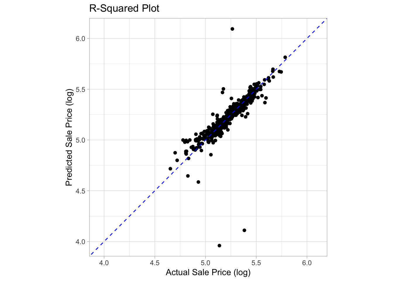
ggplot(ames_preds, aes(x = sale_price, y = .pred)) +
  geom_point() +
  geom_abline(color = 'blue', linetype = 2) +
  coord_obs_pred() +
  labs(title = 'R-Squared Plot',
       y = 'Predicted Sale Price (log)',
       x = 'Actual Sale Price (log)')